Tuesday, 12 September 2017

Polyester Lithography

This summer I took a 5-day workshop on polyester lithography.
'Flooded Britania", one print I managed to complete during the workshop 

Lithography is a planographic printmaking process- everything is taking place on a flat surface without higher or lower inking planes.  Lithography is based on the fact that water and oil repel and that ink will be attracted by oily surfaces.  So on a piece of limestone, the artist uses a greasy drawing medium to create an image , and the stone is kept damp while the ink is rolled onto the stone.  A special press needs to be used, a lithography press which accommodate the stone slab ( about 100 mm thick). This seems simple but in fact several chemical process take place to prepare the stone (it is reusable ). That is almost all I know of stone lithography, besides the fact that it is considered the printmaking technique closest to painting as the artist literally draws or paints on the image.
  This Spring, polyester lithography was the big buzz in town and a class was offered at the School of Art in August.  i had heard that it was simpler and relatively inexpensive and one did not need dedicated printmaking equipment; one can use Sharpie markers, China markers, india ink, ballpoint pens, acrylic paint, toner solution  to create an image on a special film of polyester, and with some prep with gum arabic solution, and with a solution of water and civic acid for dampening the plate, one could print with an etching press or even by hand  with a barren or a wooden spoon.

That is basically what we explored during that workshop,  the  kind of image we get with different writing mediums, how durable is the plate prepared with different medium for multiple prints, whether  heating the plate make a difference, what about the viscosity of the ink, and the type of paper, and dampening the paper, how to make a multiple color image & registration, and how to separate colours of a digital image using Photoshop  and get multiple plates of their primary colours.

In the workshop, after a day, a day and a half of playing around  and  trying everything  and figuring out the steps, i calmed down and decided to limit myself to two images and try them with different drawing mediums and papers to understand how everything responded.  it started to get better for me when I figured out a plan of action.

 The print above was done with two plates.  Most of the image was drawn with sharpie markers and china markers and the water and clouds were done with  touch, a toner solution applied with a brush.  i had tried create the water with acrylic paint and i found that it create a solid opaque value, which was not what i was looking for.  Toner solution has more dispersed particulates and this created different values.

The print below was my first  attempt at that two-plate image on good paper.  I used china markers for tree shapes and birds and grass, and brushed-on acrylic paint for the blue areas, and damp BFK Rives paper.  The very absorptive paper seemed to have evened out  the brush strokes of the acrylic paint (on newsprint, these showed) , which was disappointing. I chose to start over with a new set of plates, and this time, i heated the plates on a hot plate at about 200-220F.  This seemed to reduce peeling of the image.  I was looking for  a more painterly look for the pond and for that, I switched from acrylic paint to Touch ( toner solution), and it did create more texture (See the print on top).
After a few trial on newsprints,  I tried with good paper and it created a different feel.  Also the image on the plate was starting to fade or peel off, so few 'good' prints would be possible.  I found that heating these plates made the image on the plate more durable.

Thursday, 6 July 2017

An experiment with acrylic pourable medium over oil pastel painting


A while back  I  did an oil pastel  painting on a wood board and this tends to remain sticky for a long time.  Now it has cured but it is still crumbs of oil pastel; on it. So I thought it would be a good subject for applying  a clear pouring acrylic medium on it,.  The acrylic medium would seal the surface of the painting and protect it.  

So last summer I set up a space outside to do it.  The first challenge was to set it up outside (the smell of the medium is quite strong) and have the artwork levelled - on the ground over a plastic sheet, not so easy.  As one pours the medium, it spreads over the surface.  If the artwork is not levelled, the thickness of the clear coat will not be uniform.
Before application. Doing it outdoors,  small flies can get into the goo..


During application.It is milky white at first and dries clear

 It really made me think of liquid wax for floors in the old days. It is self-levellling- mind you the surface for the application must be levelled, so one has some control over the thickness of the coat.  


It dries quickly, like in less than 24 hours.
Very easy to apply. It worked great and I like the result. Very modern slick look, and it protects the oil pastel.  i will see how it ages.  It has been a year and I have not noticed see color changes.

Saturday, 1 July 2017

Fenêtre sur l'hiver/ Window on Winter

Mon pays l'hiver

This all started with this project to do a calligraphy with the Mon pays song by Gilles Vigneault in June.  The meandering book shown in a previous post came out of this challenge.  But to get there, i tried different things, and one of them was to write using felting wool.  As I  have a collection of wool sweaters bought in second hand shops, the idea of winter, sweaters, and 'tuques' grew, and I could see in my head which seater i wanted for the background.  This sweater reminded me of old winter sweaters that one sees in kids story books, like the ones by Robert Munch, and the colours and patterns were perfect for that vintage look.

 I did a first time similar project with the needle felted tree on a felted sweater a few months back ( another recent post) , and enjoyed it.
When time came to get a frame, I looked into my stash of white, black and natural wood frames, and nothing seemed to work.   Then S suggested I look into my stash of old window frames I pick up on the street on garbage day, and is piled up against the foundation wall of the house.  I jumped with enthusiasm about finally using one of those. ( I kept them for stained glass projects).  one of them was the perfect size. It had been exposed to a winter outside, and the zillions coats of green paint peeled off very easily.  I started to take care of it,  sand it, let it dry in the sun (the end grain  wood was so absorptive)- labour of love. I finish it with white chalk paint & clear wax , to keep with the wintery feel.

Une fenêtre sur l'hiver/ A window on Winter, collage of wool and wool felting

I believe the window frame is the bottom sash of a vertical slider window.  The sash measures 16 in by 24 in. A vertical slider window would be about 16 in. by 46 in.  In our neighbourhood, this size of window was used in bathrooms.

Note the recess in the wood on each side (jamb) and at the sill;  this was probably to line up with the trim that extended to the lath and plaster finish (walls were quite thick then- around the beginning of the 20th century).  This kind of woodwork detailing is not common in todays construction.
I love the fact that the brass handle was still in place. Yap, I love it!


Monday, 26 June 2017

Calligraphie et livre de méandres/ Calligraphy and meandering book making

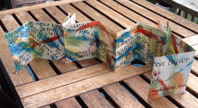
je commence par la fin...le livre calligraphié complété!
Pour l'échange annuel d'oeuvres calligraphiques à la Société de calligraphie d'Ottawa, je voulais faire un livre de méandres avec le texte de la chanson Mon Pays de Gilles Vigneault, et pratiquer l'écriture Fondation  qui était encore fraiche en mémoire et en muscle depuis les cours du soir ce printemps.
Alors j'ai pris une feuille de papier textWove, dont j'entends plein de louanges de plusieurs calligraphes, je l'ai divisé en deux sur le long et j'ai décidé de le couper très simplement pour faire un petit livret genre accordéon.

je voulais créer un fonds joyeux  qui donnerait de la texture et du rythme visuels. j'ai vu Gilles Vigneault en spectacle et il danse , bouge et s'exprime beaucoup avec de grands gestes. Mes coups de pinceau me rappellent son élan.
J'ai utilisé des encres acryliques et un pinceau et voilà.  J'ai tout de même fait un essai avant, pour m'assurer que  l'encre des cartouches des plumes  à lames parallèles Pilot pouvait adhérer aux encres acryliques.

Per souci de simplicité et parce que j'ai beaucoup de difficulté à me soumettre aux exigences  de la ligne droite, j'ai décidé d'écrire chaque paragraphe comme si le texte dansait du disco sur la page- donc sans chorégraphie  apparente. j'ai trouvé ça très libérant et relaxant.


Voici le premier coté de la feuille


Les encres acryliques 

La feuille coupée

Thursday, 8 June 2017

Losing My Marbles over Making Marbled Paper

Marbled papers- wow this is so much fun!

In May I took a one-day workshop on European marbling at the Ottawa School of Art.  soo much fun...
Everything was ready for us... the mordanted paper, the carrageenan bath, the acrylic paint,  the combs, the whips, all at our individual station!  Ah...  le bonheur.

Nancy F., our instructor and accomplished papermaker and marbler, intertwined demonstration and creation time  with a given technique very well.  All seven of us were working franticly,   creating all kinds of patterns and color combinations.  It was amazing to see everyone's paper in the drying racks.  We each ended up with over 20 great prints.

Looking forward to another session with Nancy in the Fall!

It will be so cool to use these in my handmade books and cards.  

I am thinking of using these to make my first chinese thread book.


Current exhibition of Ottawa Gatineau Printmakers Connective


For the Birds/ Pour les ornithophiles


Symphonie de couleurs ce printemps

Des tulipes , encore des tulipes..  enfin de la couleur...

Ce printemps a été froid et pluvieux et cela a eu pour effet de retarder l'arrivée de tulipes dans nos parcs jusqu'au mois de mai.  Elles ont aussi duré plus longtemps pour cette raison.  Elles sont été superbes cette année, les photos en témoignent...


Quelle fraicheur cette tache rouge qui s'élève dans une mer bleue!


J'avais pris un cours de peinture en plein air  en avril et une de nos excursions étaient  à la ferme expérimentale. J'ai peint une 'bunch' de tulipes et des jonquilles. J'ai utilisé des 'oil bars' pour peindre.  j'avais bien aimé travailler avec ces bâtons avant et je me suis dit que c'est portatif.  Par contre, c'est très lent à sécher, donc pas si portatif que ça...  J'ai dû mettre une feuille sur ma peinture de tulipes pour la protéger durant le transport à bicyclette jusqu'à chez moi.  En arrivant j'y ai trouvé une belle estampe fantôme!

J'ai choisi une vue de l'arrière des jonquilles pour cette peinture, ou est-ce la vue qui m'a choisi? 

Ca m'a pris du temps m'installer en plein air pour travailler et me concentrer, mais quand la lumière fût, c'était  magique!

Estampe  'accidentelle' faite en déposant une feuille sur la peinture à l'huile fraiche.  J'aime la délicatesse des traits, et le mystère que ça crée.